Making a bouquet: Picking commit emojis
Commit emoji are a great idea. Start your commit title with a 🐞, and it’s clear that the commit is a bugfix. Having the emoji adds context to the message without lengthening it, and makes the commit easier to find: whether using search, or just browsing through the history, you have an obvious marker to look for.

An example of gitmoji, the project that popularized the concept.
For this to work, however, you need a list. A finite set of pairings, between emoji and meaning. The list must be unambiguous, so that you always know which emoji to insert in your message, and which emoji to look for in the history. And the list must be easy to remember, so that you don’t need to scrutinize it every time you commit.
That’s my take, anyway; look around online, and you’ll find that not everyone agrees:

Right. Time to make our own list.
Commit emoji for Mac apps, version 1
I think you can only make a usable, pragmatic emoji set by focusing on a specific kind of project, so I scoped mine to Mac apps. (It’s probably usable for a bit more.) Here’s what it looks like:
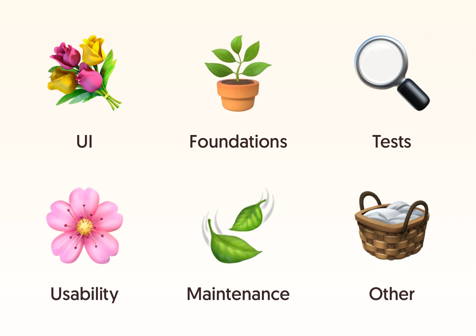
- 💐 User interface: Changes to UI or functionality.
- 🌸 Usability: Bugfixes and performance improvements.
- 🪴 Foundations: New app code that doesn’t run yet.
- 🍃 Maintenance: App code maintenance with no visible effect, such as refactors.
- 🔍 Tests: Changes to tests.
- 🧺 Other: Anything else.
Only six categories, and each has a precise definition. Equally important is the golden rule for choosing one: a commit is tagged with the first matching category.
This one rule readily eliminates ambiguity. Many commits will fit multiple descriptions — for instance, a bugfix that also introduces some new tests — but that’s not a problem anymore: the first category wins, period. The categories are intentionally sorted with the higher-impact ones at the top, ensuring that less-relevant changes never shadow the meaningful ones.
The set is designed around the way I personally work, so the way it’s split likely won’t look right to everyone. It’s been in use in the Retcon repo for almost four years now, and it’s worked well! Its biggest flaw has to do with the two most prominent categories — more on that later.
From metal to terracotta
When choosing the actual emoji for the categories, I didn’t want to go with the usual brick/hammer/construction metaphors. Surely, the act of creation is not performed solely by industrious men hunched over tool-laden workbenches.
So I went with gardening! It’s refreshing, evokes nature and the outdoors, and it’s literally about carefully tending to something that’s growing over time. In the metaphor, the 💐 bouquet is the finished product; each 🌸 flower contributes to it. These come, obviously, from 🪴 a plant you might have potted, and that you’ll need to 🍃 trim sometimes. And — I’m stretching the theme, here — maybe you’ll look for bugs using a 🔍 loupe, and carry some of your equipment in a 🧺 basket.
The overall vibe feels nice and cozy to me, and brings a bit of relief from the usual, overused industrial imagery.
Three colors
The six categories are arranged into three groups: user-facing changes, app codebase care, and the rest. These somewhat map to why you’d look for certain categories: when writing release notes, you’ll be looking for UI changes and bugfixes; when tracking down a bug, you’ll look for anything that touched app code.
To make visually scanning for these groups easier, they’re color-coded! 💐🌸 User-facing changes get bright pink and yellow; 🪴🍃 foundational codebase work, seedling green; and the 🔍🧺 modest, behind-the-scenes commits stick to black and brown. This means you can very quickly assess the nature of a branch just by skimming its history; the more vivid the hues, the more user-facing the work.
Big + small
Now, here’s the flaw with this system: when strictly following the rules, even the smallest functional changes end up with 💐 (“changes to UI or functionality”). The emoji ends up denoting both significant new features, and tiny forgettable improvements, which really don’t belong in the same group.
It’s 🌸 (“bugfixes and performance improvements”) that ought to cover the smaller changes, but how do you precisely, unambiguously describe the difference between a big and a small addition?
You could try to at least separate out the purely cosmetic changes, but these aren’t easily defined either. Sometimes, simply changing the color of a button can make its role more understandable; if people didn’t know to use it before, you’ve essentially just added missing functionality. Even just nudging an element a dozen pixels to the right can visually align it with something else, conveying its purpose more clearly, just through layout. Aesthetics and usability exist on a gradient, making it hard to draw the line.
So right now, the Retcon repo has commits like “💐 What’s new window: Fix typo”. A spelling correction is always welcome, but hardly deserves the celebratory bouquet. Room for improvement!
Final notes
I’ve been pretty happy using this set, and maybe it can serve as inspiration to make your own, or even be used as-is.
There’s the question of whether such a scheme can actually be used at scale: a system with more emoji will be less effective because of ambiguity, and the limits of human memory; but a more focused system will only work for certain projects, and people working on multiple things in parallel will need to remember competing systems, which further increases complexity.
If you have ideas on how to fix my overlapping UI category issue, please do share; I’m on Mastodon and Bluesky.
In action
Dye, my small Mac app for changing theme color per-app, uses this system. Have a scroll through its commits, and get a feel for how it looks in practice.
Text replacement
When writing a commit message, it’d take forever to find the right prefix using the emoji palette every time. I set up text replacements to make the process instant: for instance, &:m gets replaced with 🍃, &:t with 🔍, and so on.
Prior art
This is not a new idea. Here’s some other proposals:
- gitmoji, the most popular list
- Robin Pokorny’s git3moji and Ahmad Awais’s EMOJI-LOG, the most thoughtful takes I could find
- Danny Fritz’s repo
- Mohammad Khanqah’s styleguide
- Babak K. Shandiz’s blog post
- Jonathan Irvin’s article